
Pain Revolution

Context.
In late 2024, I was presented with an opportunity by Pain Revolution to evaluate their digital presence and propose strategies to enhance user engagement.
Pain Revolution is a nonprofit organisation dedicated to empowering communities to understand and manage persistent pain through evidence-based education. Their mission deeply resonated with me, not only for its focus on improving lives but also for its alignment with my passion for simplifying complex information through thoughtful design.
As I explored their work further, I identified several challenges within their digital presence and communication strategy that limited their ability to connect with a broader audience. Driven by a strong belief that design can amplify impact, I developed a proposal to enhance their brand identity, simplify technical pain management concepts, and create more engaging and accessible digital experiences.
Type : Design Proposal
Duration : 2 weeks
Role : Design Strategist
Team : Solo

Background artwork created with the help of Midjourney AI

My goal in conducting this research was to gain a comprehensive understanding of Pain Revolution’s current strategies and pinpoint areas for improvement. By analysing the website and social media presence from my perspective, this research aims to clarify where the organisation stands in terms of engaging its audience and effectively communicating its mission.
WEBSITE STUDY
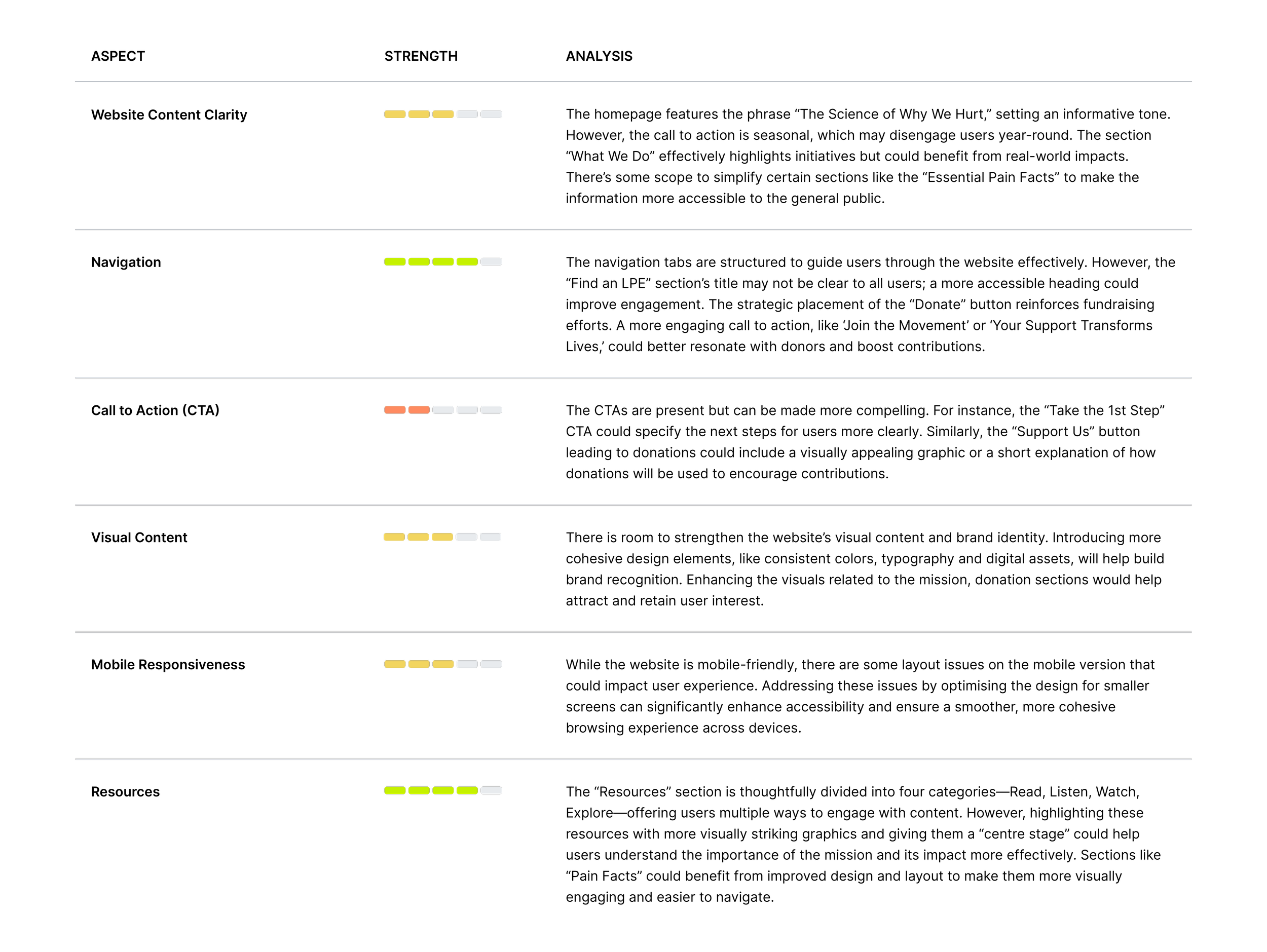
SOCIAL MEDIA STUDY


IDENTIFY THE PROBLEM
Through my conversations and research, it has become evident that Pain Revolution is a highly impactful initiative dedicated to educating and empowering individuals suffering from chronic pain. However, despite their strong commitment and evidence-based programs, there remains a gap in how their mission and brand identity are communicated to the public.
The core challenge lies in simplifying complex concepts surrounding chronic pain management and establishing a cohesive brand identity.
Enhancing clarity in both messaging and visual representation will be essential for Pain Revolution to connect more effectively with its audience and raise awareness of its mission.
STRATEGIES

Simplification of Concepts
Simplify complex concepts related to chronic pain and its management, making them more accessible and easier to understand for the general public.
This will involve crafting clear and relatable messaging that resonates with those experiencing persistent pain.

Stronger Brand Identity
Establish a cohesive and recognisable brand identity for Pain Revolution that effectively communicates its mission and values, helping to foster trust and engagement with the audience.

Year-Round Digital Content Strategy
Develop a comprehensive digital content strategy centred on the annual rural outreach tour to raise awareness, and foster a community around Pain Revolution’s mission.
This to be complemented by multiple targeted campaigns throughout the year that emphasise the importance of evidence-based pain management and highlight the positive impact of their work.

Simplification of Concepts.
One of the key challenges in Pain Revolution’s digital presence was the complexity of their educational content. While their focus on evidence-based pain management was compelling, the technical language and dense information created barriers for their primary audience: individuals experiencing persistent pain and community health professionals looking for accessible resources.
UNDERSTANDING THE COMPLEXITY
The content was highly specialised, relying on scientific terminology and academic frameworks. This made it difficult for a general audience to quickly grasp the core ideas, potentially leading to disengagement or misinformation.

DESIGN APPROACH
To address this, I applied key UX principles of accessibility, clarity, and engagement. My goal was to make the information scannable, visually appealing, and easy to understand, even for those with no prior knowledge of pain science.

Content Chunking
• Divide dense paragraphs into smaller, digestible sections with clear headings and subheadings.
• Use bullet points and numbered lists to make information easier to scan.
• Highlight key takeaways in bold or coloured text.


Infographics and Visual Aids
Replace text-heavy explanations with simple diagrams or illustrations to convey ideas visually.


Interactive Elements
• Design interactive modules like collapsible sections, tooltips, or step-by-step guides for delivering layered content.
• This allows users to control the depth of information they consume based on their interest or expertise.

Brand Identity.
Establishing a cohesive brand identity is crucial for Pain Revolution to communicate its mission effectively. This subsection examines the current brand palette and proposes subtle refinements designed to enhance the organisation’s essence without making significant changes.
Brand identity goes beyond a logo or name—it’s the overall impression people have when they interact with an organisation. Colours play a key role in shaping this, as they evoke emotions and influence perception. A well-chosen palette ensures consistency, making the brand recognisable and memorable.
The goal was to maintain the core identity while introducing a bolder, cleaner aesthetic without major changes. These updates refresh the brand, making it more appealing and impactful, creating a distinct identity that resonates better with the target audience.

COLOUR USAGE AND TYPOGRAPHY
The existing colours of the organisations colour palatte can be enhanced by exploring varied combinations that maintain brand consistency while offering better contrast and clarity across different mediums. This section highlights how the proposed brand palette interacts with typography, focusing on readability and visual appeal.

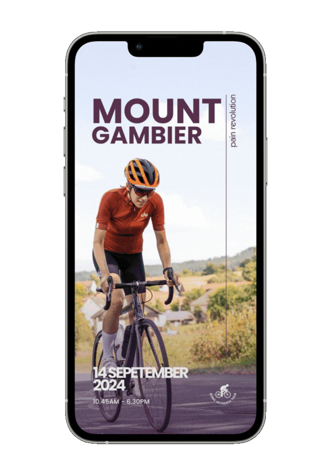
Extending the Brand Across Print Media

Event Flyer Mockup

Event Brochure Mockup
Year-Round Digital Content Strategy.
To strengthen Pain Revolution’s outreach, I proposed a Year-Round Digital Content Strategy designed to keep audiences informed, engaged, and inspired. Rooted in an understanding of their user needs, I outlined a framework for delivering educational and motivational content that aligns with the organisation’s mission
Types of Content
1. Monthly Themes:
Focused campaigns around specific aspects of pain management to educate and maintain engagement.
2. Sharing the Cause:
Posts and stories to raise awareness about Pain Revolution’s mission and its impact on communities.
3. Event Updates:
Timely updates, behind-the-scenes content, and countdowns for events like the annual bike ride to build excitement and generate traction.
Quality of Content
1. Visual Consistency:
Developing templates for social media and other digital platforms, ensuring recognisable and professional branding.
2. Interactive Content:
Introducing engaging elements like quizzes, infographics, and short videos to make complex topics accessible and memorable.
ENHANCING ENGAGEMENT THROUGH CONSISTENT CONTENT

Takeaways.
• Empathy-Driven Design Matters:
While exploring Pain Revolution’s mission, I realised the importance of understanding the audience’s struggles, both emotionally and practically. I focused on learning about their challenges and worked to create solutions that would genuinely connect with their needs. This experience reminded me that empathy is not just a design principle but a mindset that drives impactful work.
• Clarity is Key:
Throughout this experience, I came to appreciate just how vital clarity is in design and communication. Analysing Pain Revolution’s digital content showed me that even the most valuable information can fail to make an impact if it’s not presented in a way that’s easy to understand. This project reinforced my belief that simplifying complex ideas is not about losing depth but about making them more accessible and actionable. It highlighted how thoughtful design can bridge the gap between expert knowledge and audience understanding, a principle I’ll continue to prioritise in my work.
• Consistency to Elevate User Experience:
While developing a cohesive brand identity for Pain Revolution, I reflected on how small, consistent design elements—like unified templates, colours, and typography—could transform the way an audience perceives an organisation. It wasn’t just about making things look good; it was about creating a sense of trust and recognition. Seeing how this consistency could amplify their message and make their cause more relatable was a key takeaway for me.
• Design as a Catalyst for Impact:
Throughout the process, I kept returning to one thought: how can design make a difference? I saw firsthand how thoughtful, user-centric design could bring clarity to complex topics and inspire engagement. This project deepened my appreciation for the role of design in creating positive change, especially for organisations with powerful missions like Pain Revolution.