
Enactus

Context.
Enactus University of Sydney is part of the global Enactus network, a collection of student-led societies united by the common ambition of using entrepreneurial action to create sustainable social businesses.
This project focuses on redesigning the Enactus Sydney website to enhance online community engagement. Through ethnographic research and user-centric design principles, our aim was to create a more intuitive and engaging platform for Enactus Sydney members. By understanding user needs and preferences, we strived to highlight the society's mission, showcase its impactful projects, and facilitate seamless interaction with events and resources.
Client : Enactus - University of Sydney
Duration : 6 weeks
Role : UX/UI Designer
Team : 2 members

Background artwork created with the help of Midjourney AI

Problem Space.
Enactus University of Sydney's current website lacks essential features, including effective event promotion, user-friendly registration and simplicity. This limits its ability to engage members and provide a comprehensive solution. The project aims to address these issues to enhance the website's usability and effectiveness.
User Background.

User Group
Our target audience consists of Enactus Sydney members, university students actively engaged in creating, building, and managing social enterprises. These students are typically aged between 21 to 32, with a few exceptions, representing a diverse mix of national and international backgrounds.
Study Background
Enactus encourages students from various disciplines to utilise the platform for entrepreneurial actions. Consequently, the user group exhibits a broad spectrum of academic backgrounds.
Cultural Background
Given the international nature of university students, the user base is culturally diverse and tech-savvy.
Ethnographic Research.
We did ethnographic research on Enactus Uni Sydney’s social media presence to understand students’ engagement, interests and response patterns.
METHODOLOGY
To conduct ethnographic research, we utilised a mix of qualitative and quantitative methods, including:

Content Analysis: We examined the content shared by Enactus Sydney on social media platforms such as Facebook, Instagram, and Twitter. This analysis encompassed post frequency, content themes, and interaction patterns.

Social Media Metrics: We collected data on Enactus Sydney's social media metrics, such as follower counts, likes, comments, and shares. These metrics provided an overview of the society's social media engagement.

User Interviews: We conducted in-depth interviews with 7 Enactus Sydney members, spanning different demographics, academic backgrounds, and engagement levels within the society. These interviews helped us gain valuable insights into their online behaviours and expectations.
OBSERVATIONS & FINDINGS:

KEY INSIGHTS:

The findings showed strong engagement on Facebook, but there's room for improvement. Emphasising projects and events may enhance member participation. Additionally, addressing limited event exposure can positively impact member engagement.

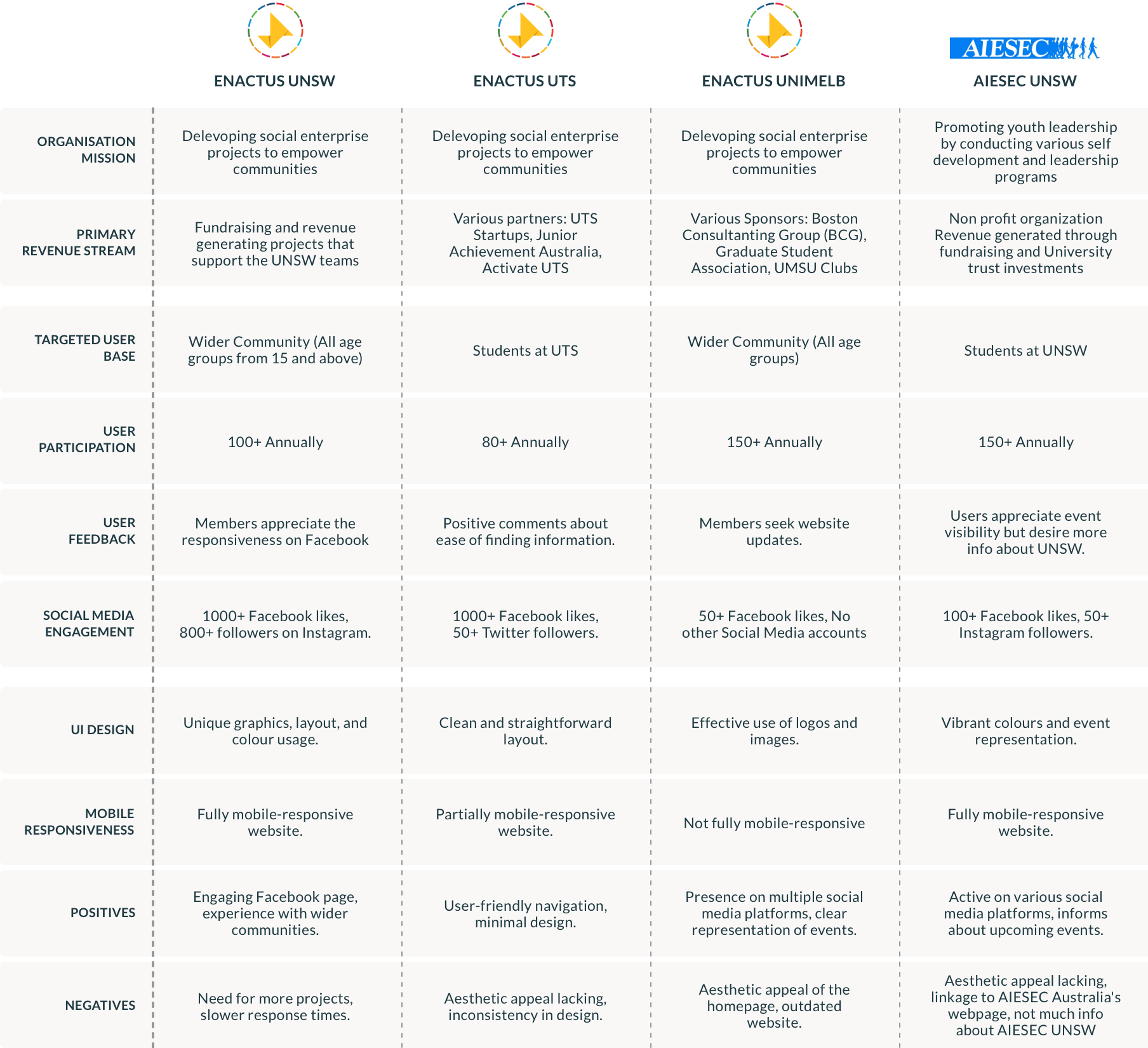
COMPETITIVE ANALYSIS
We conducted a comprehensive competitor analysis to gain insights into the online engagement strategies of four student-led organisations. Our goal was to identify best practices, assess UI design advantages, and understand the impact of their online presence on member participation.
FOCUS POINTS

USER NEEDS
Based on the background research and competitor analysis, We marked down user needs and created user personas to better understand the potential needs of students. These exercises helped decide on the functional requirements for the pages, and that I could refer back to throughout the project to keep focused.

USER PERSONAS


INFORMATION ARCHITECTURE
In our approach to designing the wireframes, we aimed to strike a balance between simplicity and functionality. The goal was to emphasize core features and create an intuitive user experience. We began by creating a site map to align with user needs and preferences. Additionally, we crafted two user task flows and documented the necessary UI requirements for key screens. Throughout the process, we continuously refined our design iteratively, to give the final product a solid structure.
SITE MAPPING

TASK FLOWS + UI REQUIREMENTS


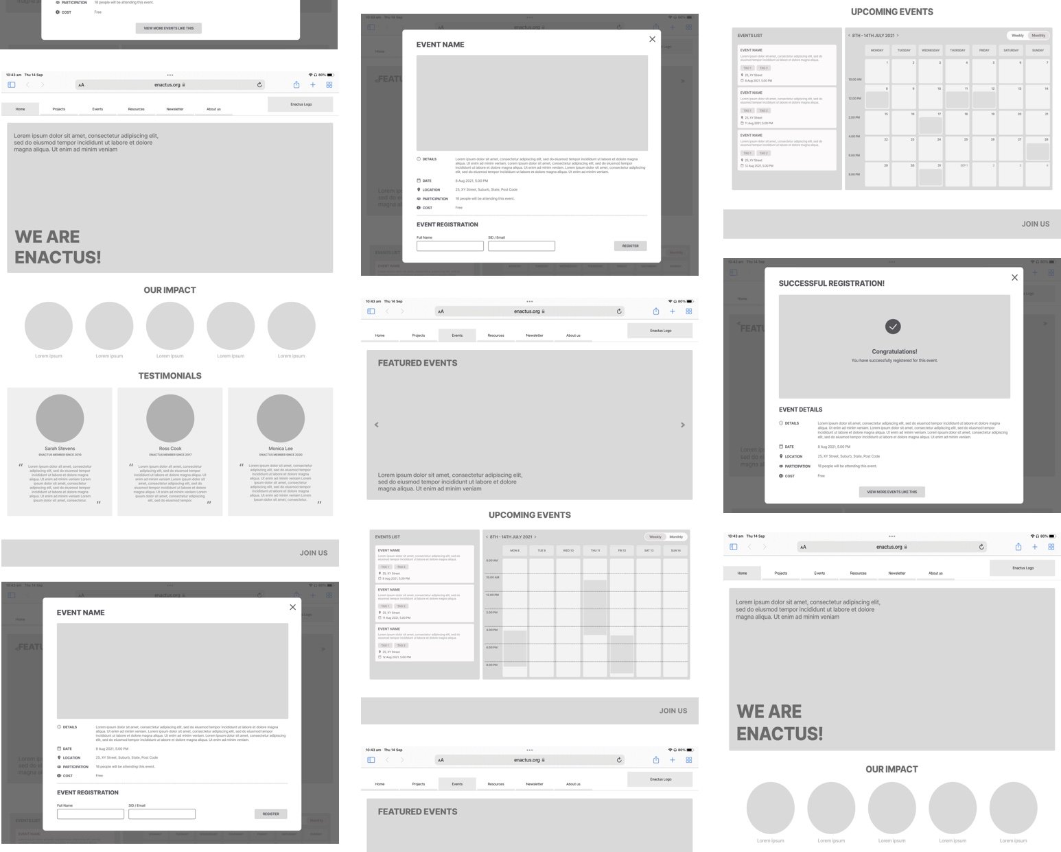
WIRE-FRAMING + MID FI SCREENS
The number of screens was kept to a minimum to maintain simplicity and ease of use. We wanted to focus on highlighting the core features. We started with pen and paper wireframes and created multiple versions of each screen until we found a combination of features and elements that we thought matched the users needs and that would be as intuitive as much as possible.
For the mid-fidelity screens, we followed a less-is-more approach, focusing on user-friendliness and simplicity. We refined the initial pen and paper wireframes through multiple iterations to ensure an intuitive design that aligns with user needs and preferences.

CLIENT SURVEY
Based on the feedback, We created two newer, high-fidelity versions of the website with dark and light modes. These versions featured better spacing, larger icons and clearer text. Another survey was conducted to understand which mode was preferred in terms of aesthetics and readability.

UI KIT
We developed a UI kit keeping in mind user-friendliness and accessibility. Going ahead with the dark mode, the color scheme for the website was inspired by Enactus's brand palette.


HEURISTIC EVALUATION + CLIENT FEEDBACK
By conducting the Heuristic Evaluation, we were able to refine what users were finding useful, and completely change up what they didn’t react well to. The users were asked to complete a few scenario-based tasks that would test the main features of the website. The results of the usability tests were recorded and analysed.

FINAL PRODUCT
In the final round of revisions, we added high-quality images with suitable text spacing and introduced colour. We created a high-fidelity task flow mockup with improved aesthetics, readability, and user feedback integration.

Takeaways.
• Designing for Engagement, Not Just Information
A website isn’t just a source of information—it’s an experience. Prioritising event visibility and simplifying the registration process made it easier for students to engage with Enactus Sydney.
• Bridging Organisational Goals with User Needs
Balancing the society’s mission with the needs of students required a user-first approach. Conducting research helped us align content and features with what truly mattered to the users.
• Iterative Design is Key
Understanding user behaviours through testing and feedback cycles showed the importance of continuous iteration. Small refinements in structure and navigation made a big difference in usability.
• Impact Through Digital Presence
A well-designed platform can amplify an organisation’s reach. By making information accessible and engagement seamless, we helped Enactus better connect with its community.
